Zul+
We unite paths and destinations
02
Estapar
2025


Context
After Estapar acquired Zul+, the company realized the brand needed to evolve — modernize its identity, connect with new audiences, and expand market share.
Estapar partnered with Marcas com Sal for research, brand purpose, and positioning. Despite strong strategic foundations, the challenge remained: the leadership team struggled to approve a new visual identity.


Solution
As Design Manager at Estapar, I took on the challenge of translating strategy into a tangible brand identity.
Through close conversations with stakeholders, I identified what the board expected: a brand that balanced modernity, safety, and emotional connection.
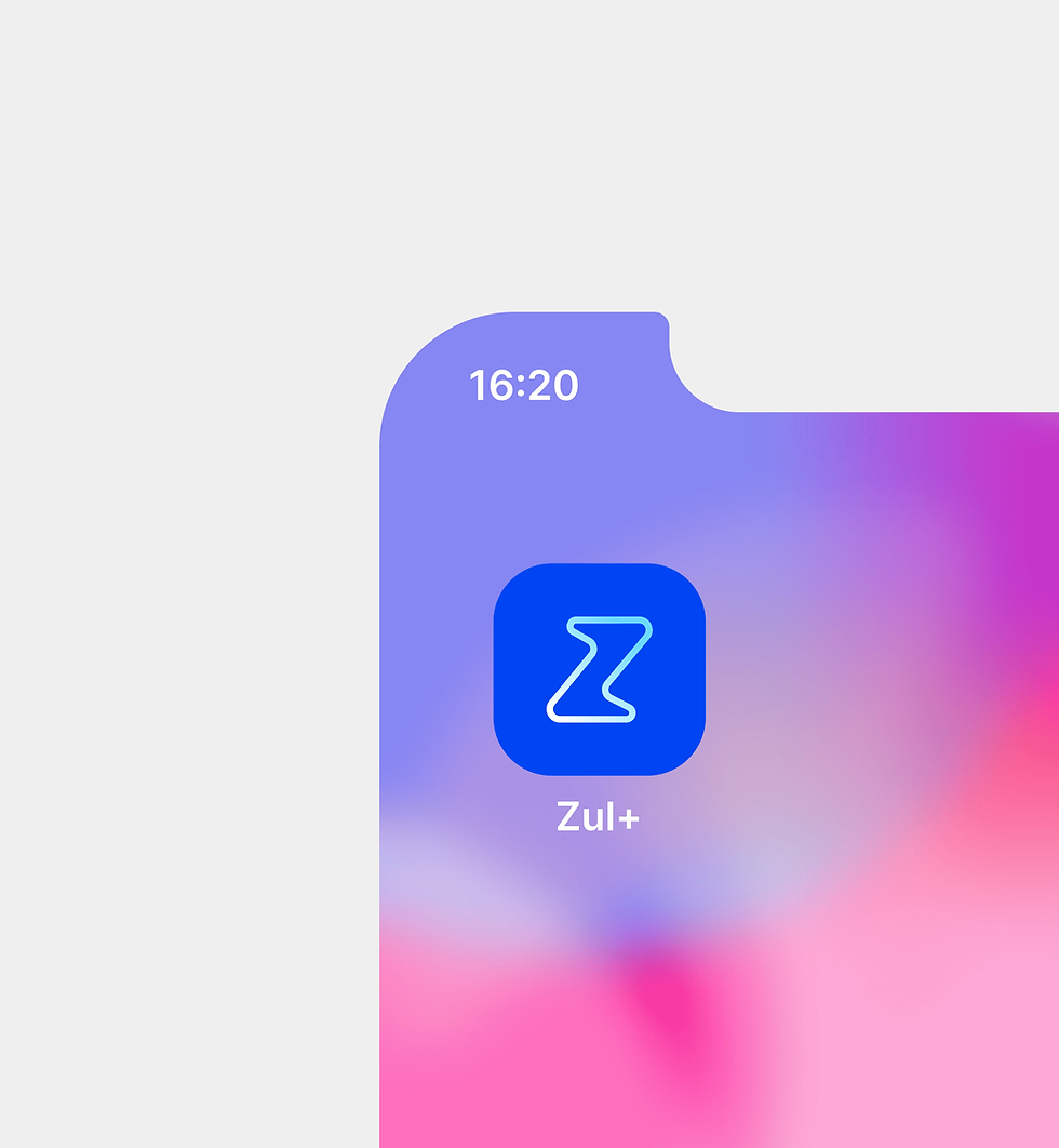
We created a visual system built on simplicity and flow — inspired by Estapar’s iconic arrow, now reimagined as mirrored outlines to convey movement, direction, and flexibility. Rounded edges and fluid forms brought warmth, friendliness, and approachability.
The result was a new Zul+: fluid, simple, friendly, and secure.


Delivery
-
New brand identity aligned with Estapar’s ecosystem
-
Visual system balancing minimalism and human connection
-
Stakeholder-approved brand, uniting both companies’ visions
-
Brand canvas defining Who we are, What we do, Who we serve, Why we matter, and How we connect


Values
At its core, Zul+ embodies four guiding principles: fluid, simple, friendly, and secure.
The new brand connects functionality with emotion — making technology feel closer, lighter, and more human. It reflects a promise to simplify the driver’s daily journey while reinforcing trust and safety.


